


Do you find yourself frustrated with managing your divs' heights in CSS? Are things not working out the way you want them to? You're not alone. Setting element heights in CSS can be challenging, but with a few tips, you can make it much easier.
Common Mistakes in Setting Element Heights
Before we dive into tips for managing element heights, let's first take a look at common mistakes people make:
Using height: 100%;
While height: 100%; can seem like a quick and easy solution, it can cause problems with overflowing content and layout issues. Instead, try using other height values like min-height, max-height, or vh.
Using px unit all the time
One common mistake when setting element heights in CSS is to use pixel (px) units for fixed heights. While this may work in some cases, it can lead to issues with responsiveness and scalability.
When you set a div's height in pixels, it will have a fixed height regardless of the size of the viewport or the size of the content inside the div. This can lead to layout problems on smaller screens, or when the content inside the div changes.
.my-div {
  height: 100vh;
}
Best Practices for Setting Element Heights
Now that we've covered some common mistakes, let's look at some best practices for managing element heights:
Use box-sizing property
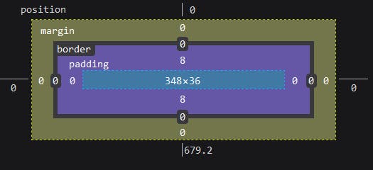
By default, the height of an element in CSS does not include padding, border, and margin. This can lead to unexpected results when setting the height of the div. To solve this and include padding and border in the height calculation, set box-sizing property to border-box
Use min-height instead of height
Using min-height instead of height can help prevent issues with overflowing content and allow elements to grow as needed.
min-height: value;
/** height: value;
Combine Units for More Control
Mixing units like px, %, and vh can give you more control over element heights and help prevent issues with overflowing content.
.parent-container {
  height: 500px;
}

.child-div {
  height: 50%;
}
Use Flexbox Distribution
Flexbox can be a powerful tool for distributing elements within a container. Consider using it to manage element heights.
.container{
    display:flex;
    flex-direction:column;
    border:1px solid black;
}
.one{
    background:red;
    flex-grow:1;
}
.two{
    background:yellow;
}
Consider vh and dvh Units for Better Control
Viewport height (vh) and Dynamic viewport height (dvh) units can help you better control element heights, especially when dealing with fixed headers and footers. However, it's important to note that dvh units are not widely supported across all browsers, so it may not be a viable solution for all projects.
Use Media Queries for Responsive Design
Using media queries to adjust element heights for different screen sizes can help you create a more responsive design.
Additional Resources
If you're looking for more tips and tricks for managing element heights in CSS, check out Web Dev Simplified's Youtube video. He covered even more insightful tips in his video.
Web Dev Simplified YouTube Channel
Watching his videos can help you better understand the concepts covered in this post and provide you with even more insights into CSS best practices. Happy learning!
Wrapping Up
Managing element heights in CSS can be a challenge, but with these tips, you'll be able to do it with ease. Remember to avoid common mistakes, use best practices like min-height and flexbox, and consider using viewport units with caution for better control over element heights. Happy coding!